Color affects how you perceive space, how you feel, and how the architecture interacts with light. In contexts such as Charleston, S.C., where historic homes and modern infills coexist, the selection of paint tones must take into account natural light, architectural details, and the character of the house. Learning how to choose paint colors for home interiors with intentionality will guide you through selecting tones that suit each room’s purpose, lighting, and finishes.
The principles that follow apply to bedrooms, kitchens, living rooms, bathrooms, and other areas that require thoughtful color strategies.
Fundamentals of Color Theory
Understanding how hues, tones, and undertones interact is foundational. Colors originate on a color wheel, with primary, secondary, and tertiary hues, and their relationships determine harmony, contrast, and mood. You’ll note that paints with cool undertones (blue, green) tend to recede visually, while warm undertones (red, orange, yellow) tend to advance.
Recognizing undertones is especially important when coordinating finishes. A beige paint with a green undertone may clash with flooring having a pinkish undertone. In homes in Charleston with historic materials such as heart pine or old plaster, you’ll want a paint tone whose undertone complements those materials rather than clashes with them.
Light Quality and Room Orientation
The way natural and artificial light affects a room must guide your choices. North-facing rooms receive cooler, bluish light, while south-facing rooms receive warmer, more direct light. East- and west-facing orientations vary throughout the day. A paint tone that looks neutral under the midday sun may shift dramatically in late afternoon or under incandescent lighting.
Artificial lighting also changes perception. Higher-temperature lamps replicate daylight, making colors appear more neutral, whereas standard incandescent lamps introduce a yellow-orange warmth. When testing a sample swatch on the wall, observe it both at night and during the day. A tone that suits a bright, sun-lit dining room may feel dull in a windowless powder room.
Room Function and Mood
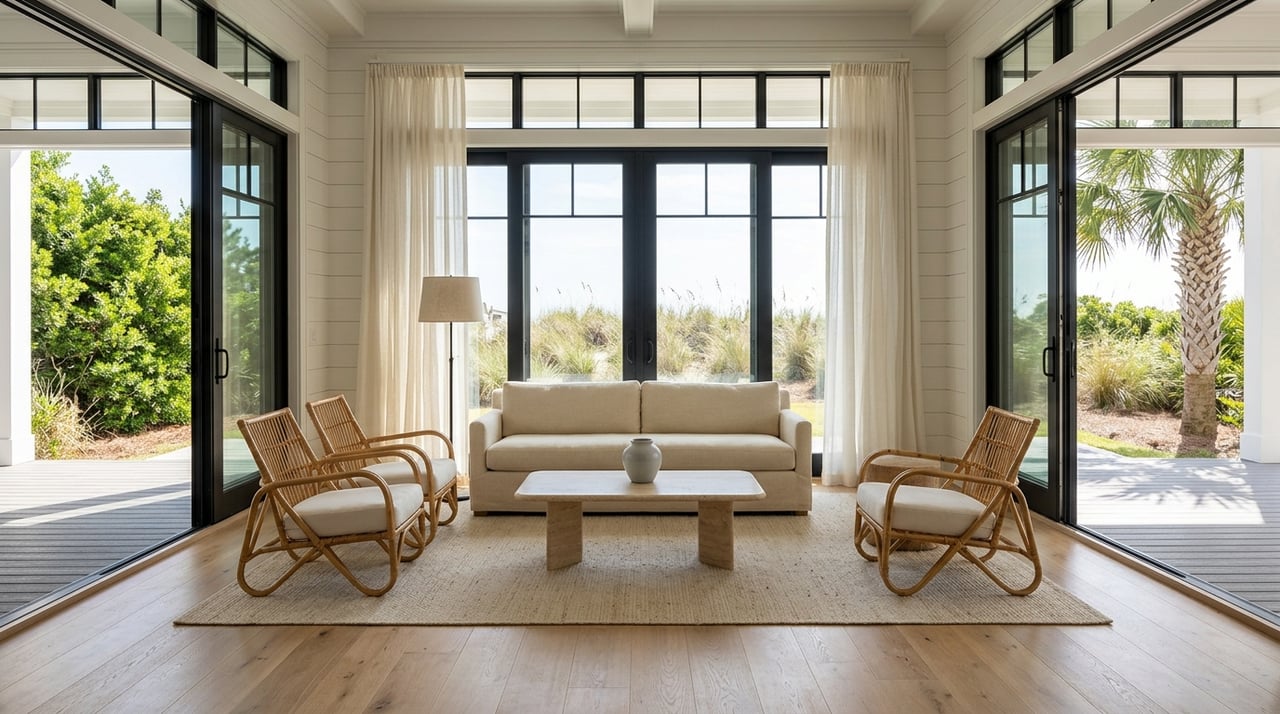
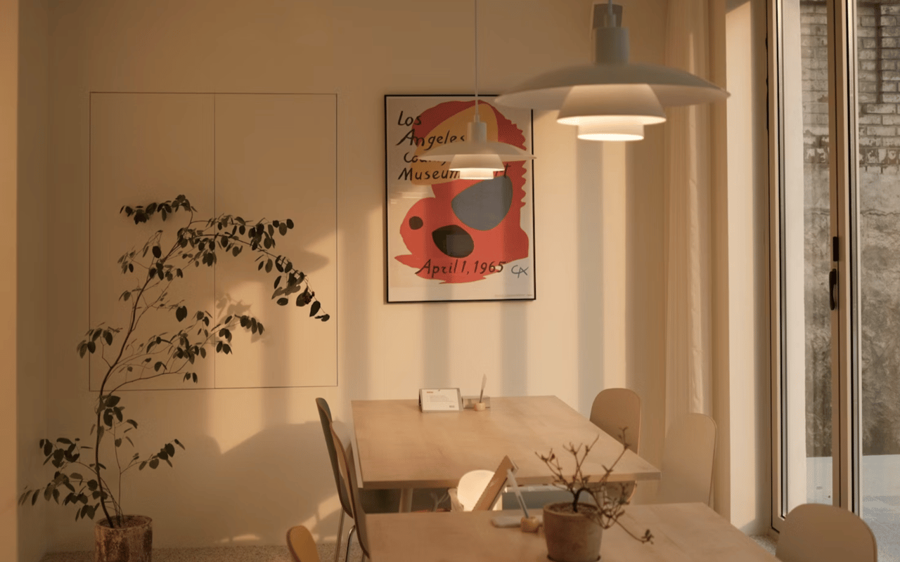
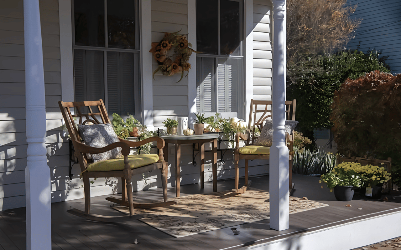
Each room serves a function that suggests optimal tonal choices. A home office may benefit from a subdued, cool-toned palette to promote focus, while a dining room may be suited for deeper, richer tones that encourage intimacy. In a charter home in Charleston’s historic district, you may choose a soft green or grey for a study, where bookshelves and traditional millwork dominate, rather than a stark white that interferes with the architecture.
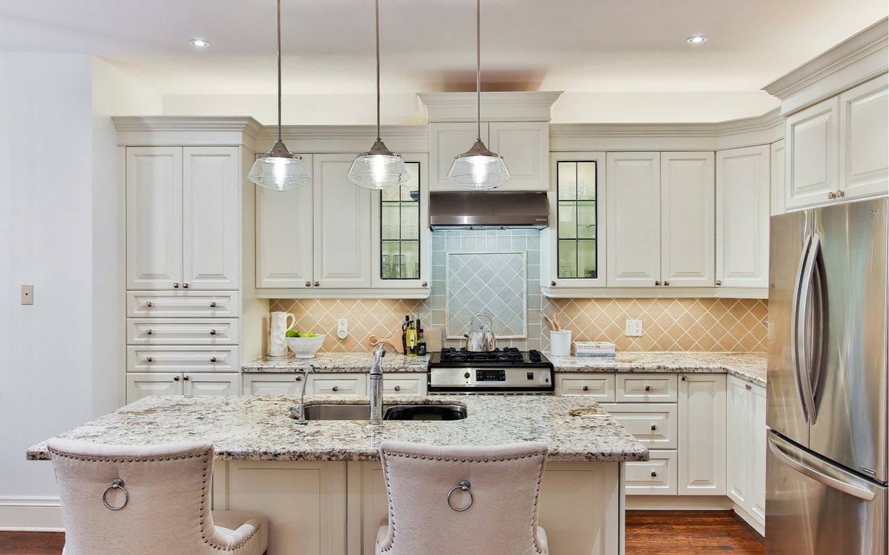
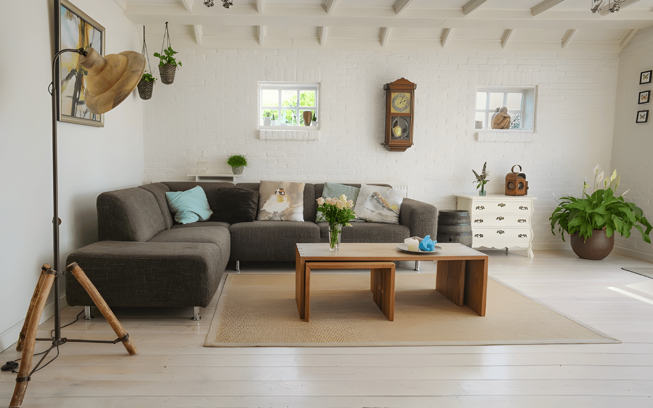
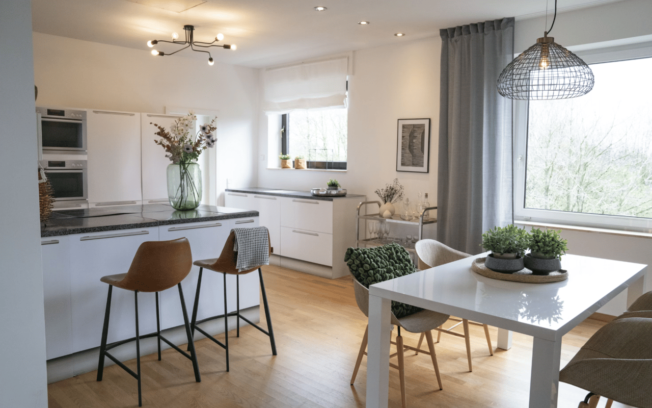
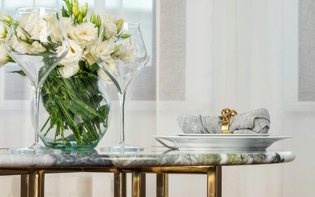
Bedrooms often suit quiet, muted tones that reduce visual stimulation as you prepare for rest. Bathrooms may feature brighter, clean tones that reflect the beauty of porcelain and tile. Kitchens may tolerate stronger accent tones, since they are lively gathering spaces. Recognizing the connection between function and paint tone helps you apply color with deliberation rather than default.
Spatial Perception and Scale
Color influences how large or small a room feels. Pale, low‐contrast tones make a space feel larger and more open, while darker or higher‐contrast tones bring surfaces visually closer. For example, a narrow corridor in a historic Charleston carriage house may benefit from a light, monochromatic paint scheme to enhance width and brightness.
Another tactic: painting trim and walls the same tone reduces visual interruptions, which can make the appearance of height or depth appear more expansive. Conversely, accentuating moldings and doors in a contrasting tone can highlight architecture, but may shrink the perceived space. For rooms with large windows and generous size, richer tones may still feel open; for small rooms or those with privacy windows, lighter tones may be safer.
Transition Between Spaces
In homes with open-plan layouts or multiple connecting rooms, you must consider how one room’s tone relates to the next. A shade that works in a formal dining room may feel out of place when viewed from the adjacent living room. In a Charleston townhouse floor plan that connects parlor, dining, and kitchen, you might deploy a consistent family of tones rather than entirely distinct palettes.
One approach uses a base-neutral tone throughout common areas, with stronger accent tones in each room to differentiate functions without jarring transitions. Matching undertones across rooms provides visual harmony when you walk through the home. If you change tone families entirely (for example, shifting from warm to cool), ensure a defined passage or architectural threshold so the transition feels intentional rather than accidental.
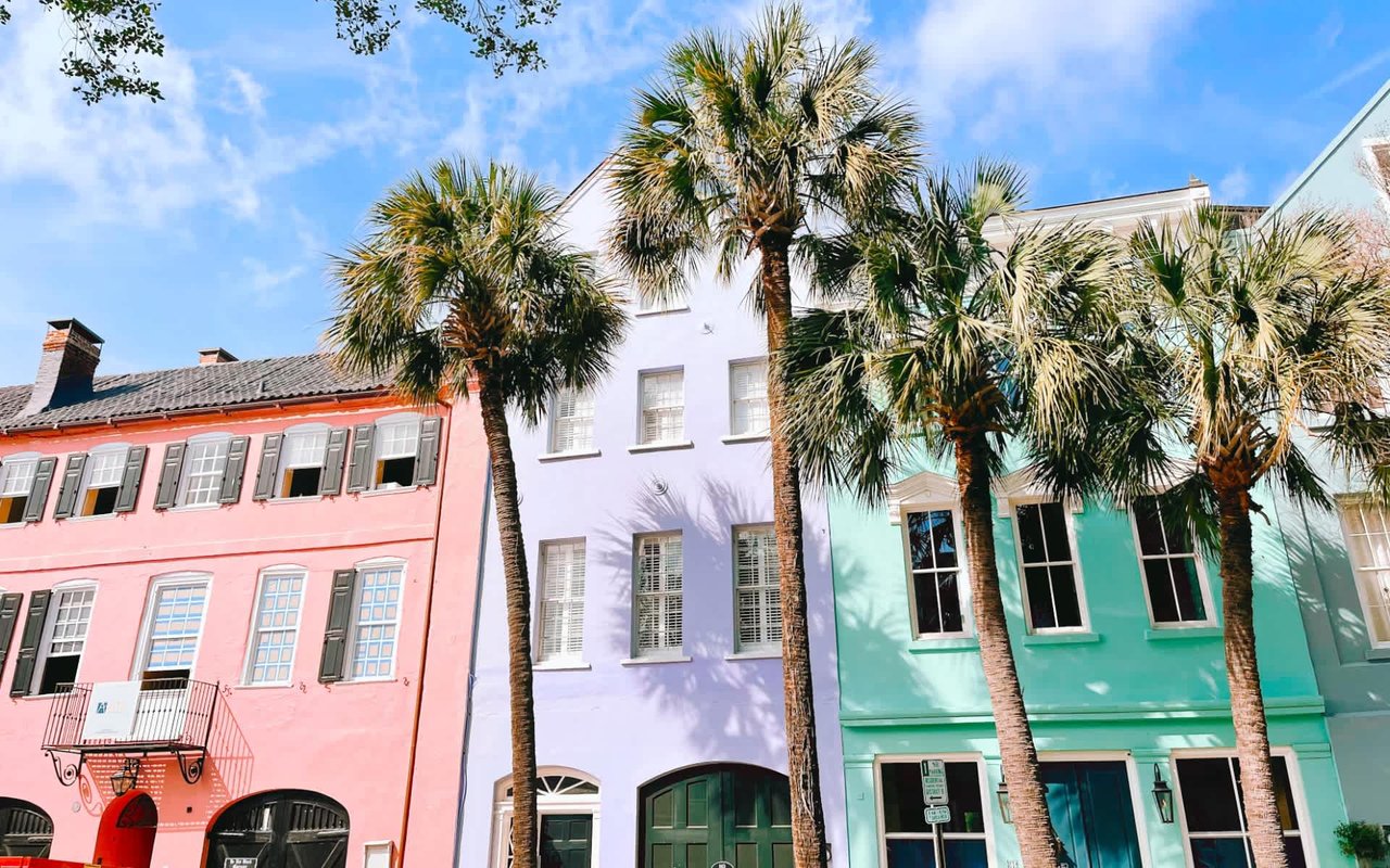
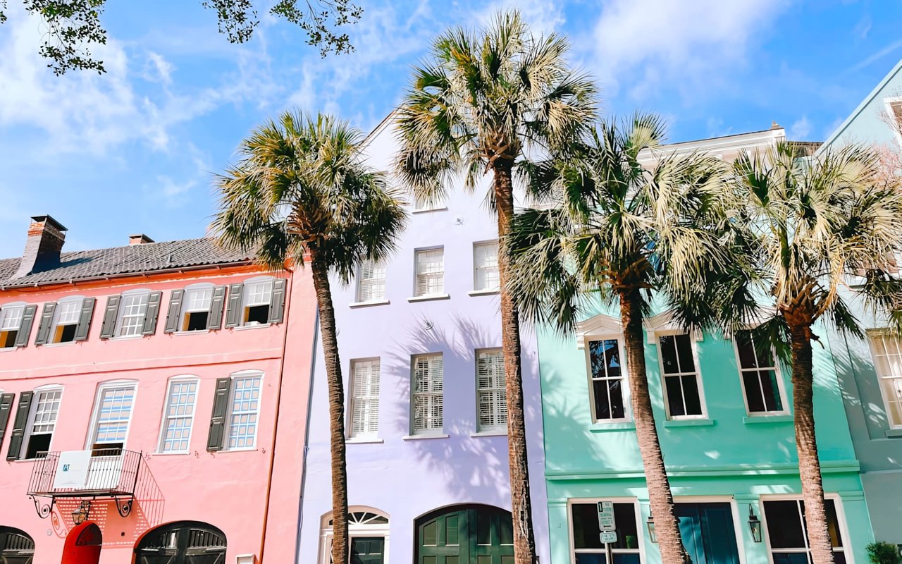
Historic Context and Regional Character
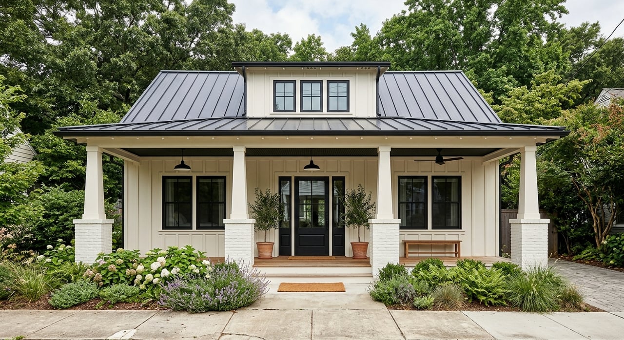
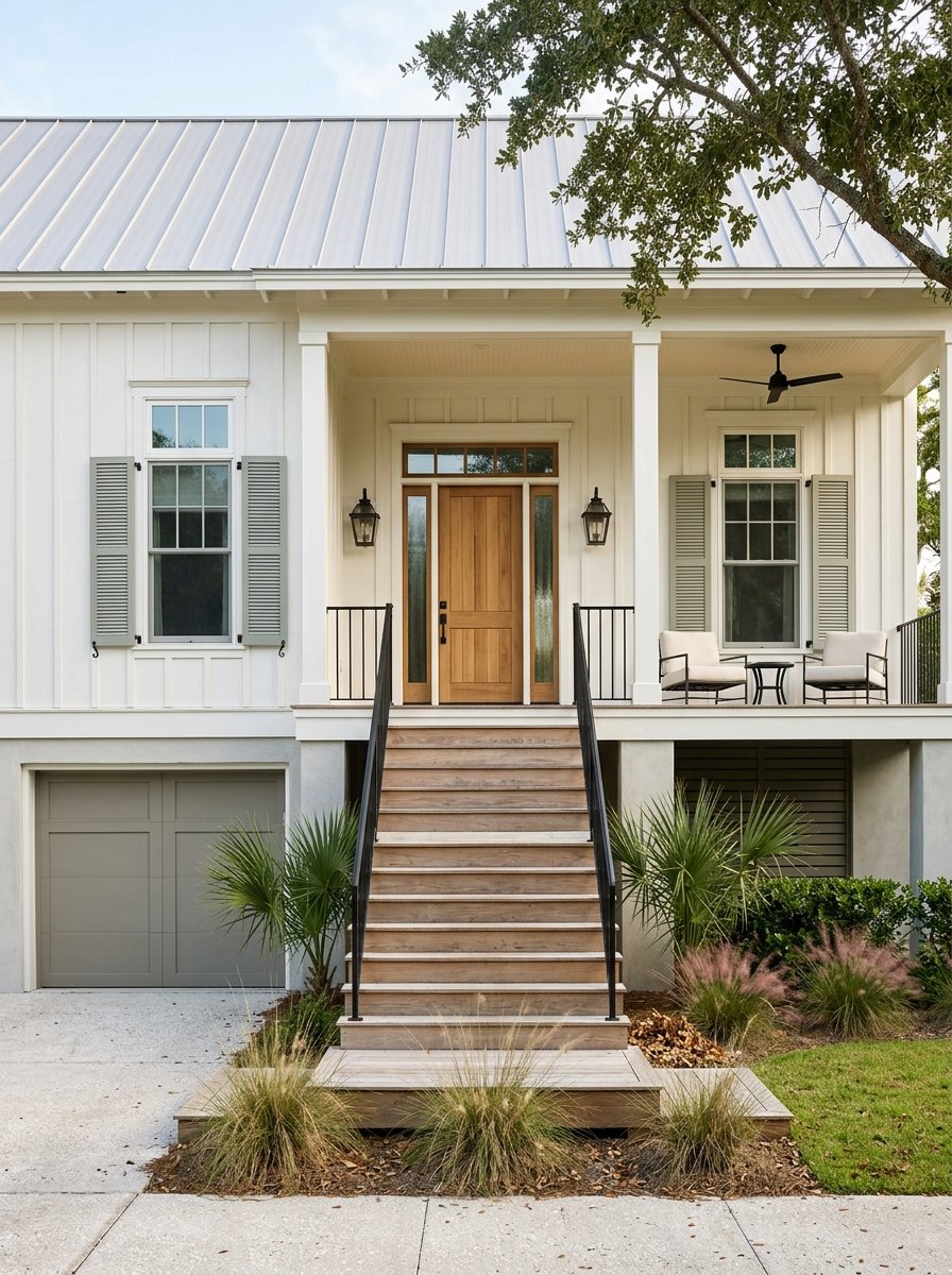
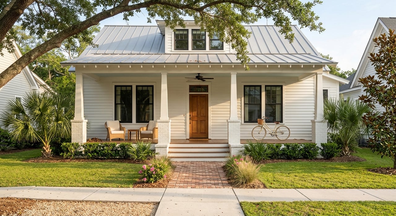
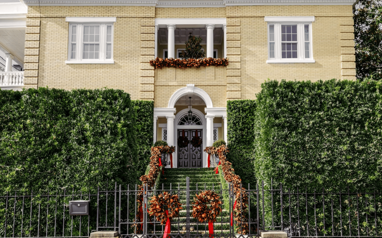
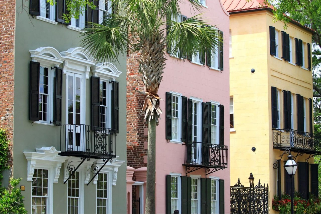
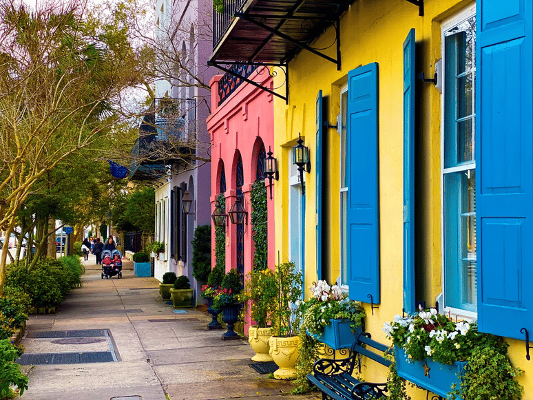
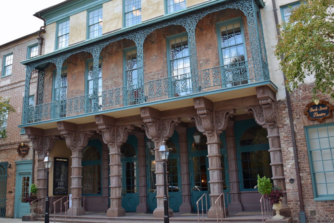
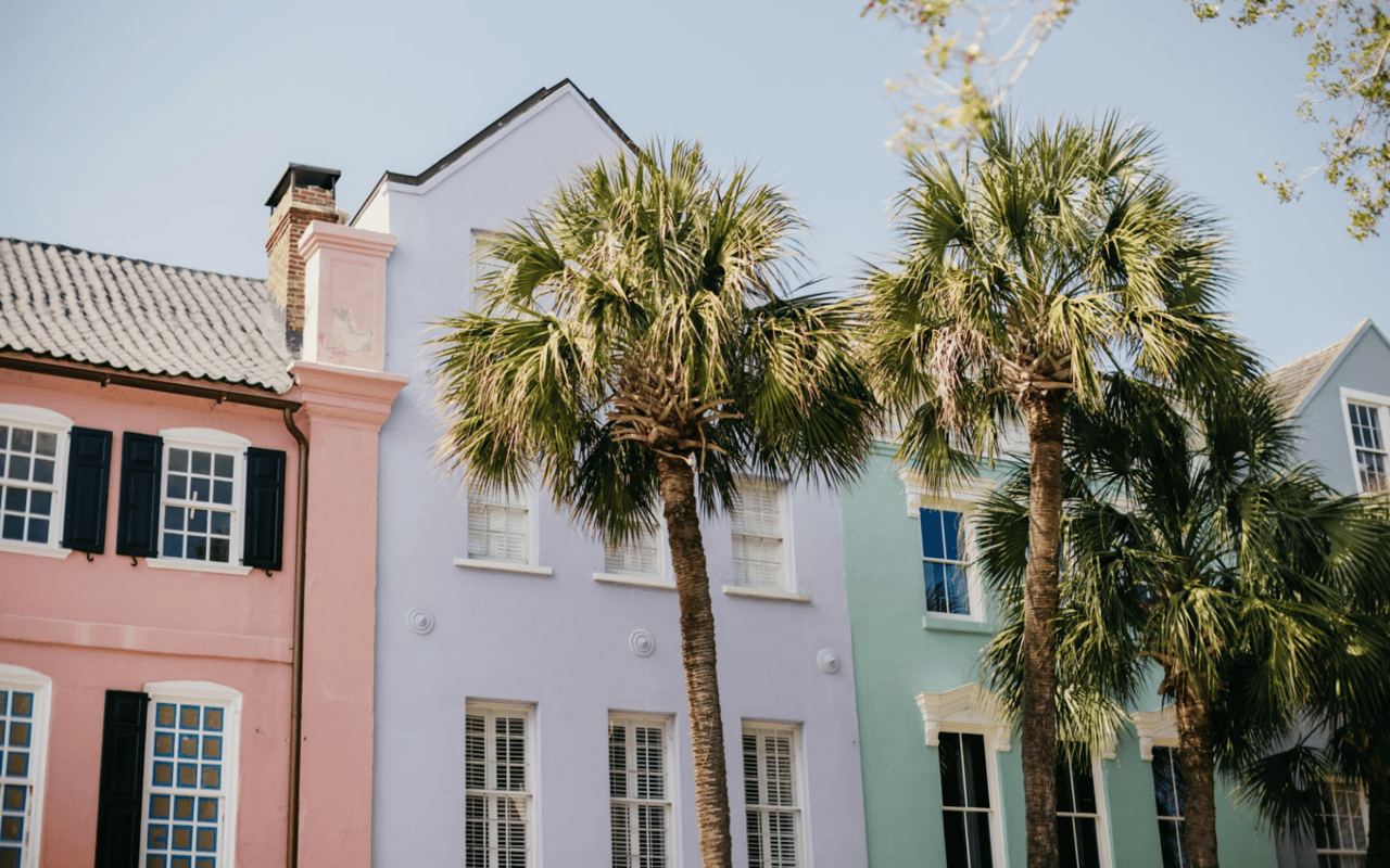
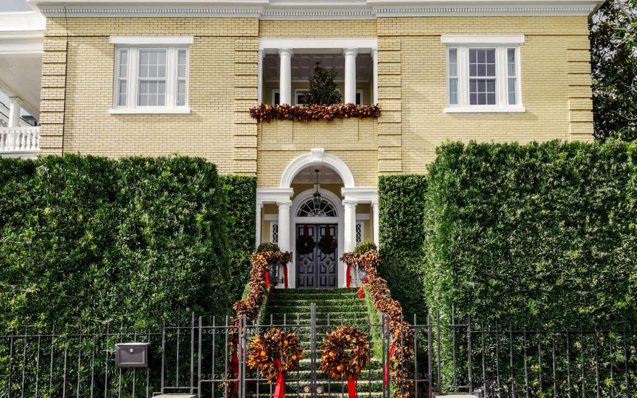
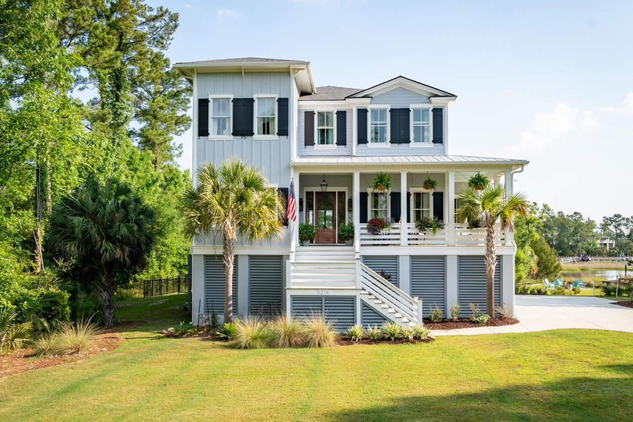
When you live in places like Charleston, where architecture features antebellum homes, Greek Revival townhouses, and historic row houses, paint tone selection must respect the context. Many older homes retain original plaster, heart pine floors, and high ceilings; your chosen tone must complement those materials. Historic homes may also feature period-correct trim colors, making matching undertones especially important.
Typical paint tones in the region may lean toward warm grays, muted blues, or soft sage greens that echo historic palettes used in the 18th and 19th centuries. If you are restoring a historic property, consulting historical color lists and the interior lighting conditions will help you select a tone that honors the heritage. Sensitivity to the architectural era, local light quality, and adjacent exterior colors ensures that the interior tone contributes to coherence rather than detracting from character.
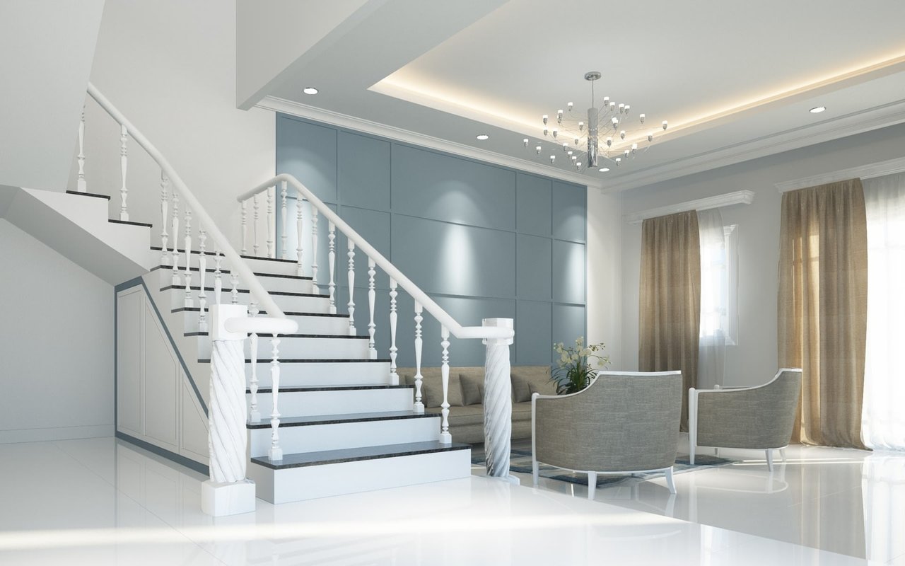
Trim, Ceilings, and Architectural Features
Trim, moldings, built-in cabinetry, and ceiling surfaces significantly influence how a wall tone reads. In a Charleston Federal-style home with wide baseboards and deep-set windows, you’ll need to test how the wall tone interacts with those white surfaces under historic gas-light replicating lamps or modern LEDs.
Ceilings often revert to white, but painting them a tone slightly lighter than the walls can lower or raise the visual height, depending on your goal. A monochrome ceiling-to-wall treatment can produce a unified space. Architectural features, such as beams or paneling, may be highlighted by leaving the surrounding surface in a neutral tone and using a deeper accent for the feature.
Contact Katherine Cox for All Things Charleston
Color selection for each room is a layered exercise in science and context, not guesswork. As you evaluate how to choose paint colors for home interiors, you will appreciate the depth of decisions that precede a seemingly simple coat of paint. When done well, the paint tone acts as a framework that supports the room rather than competes with it.
If you’re preparing to refresh rooms or work through an entire home, Katherine Cox offers professional guidance in selecting tones that align with architecture, light, and function.